Survivorship Fund Logo
We’ve been very grateful to have had the opportunity to work with Boarding for Breast Cancer (B4BC) these past couple months, and we’re stoked to finally share some the work we’ve done for them!
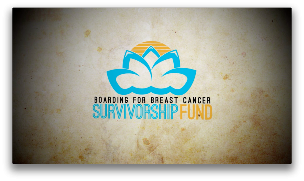
This is a logo we developed to brand B4BC’s Survivorship Fund. You can read more about B4BC and their Survivorship Fund on their blog, here: B4BC Blog.
Conceptually, the individual shapes in the logo represent 4 different elements: waves, mountains, surfboards and a rising sun. All together, they form an abstracted lotus flower to represent hope and strength.
Check it out!