Logo Design & Branding
Translate your message visually into a language your audience understands
Translate your message visually into a language your audience understands
When an organization fulfills their mission through sports, going for an All-American approach works. But Mittun also incorporated a sense of energy into the design, because SlamT1D doesn't want people watching - they aim to get people moving. And this logo gives their mission momentum.

Creating a logo that shows both compassion and importance is a balancing act. By combining the classic, all-caps font with the softer heart design, the AJA Foundation is telling everyone that they take helping people seriously.
Refreshing. Caring. Honest. That's what this podcast is, and that is what the logo had to represent. With a simple but playful font, the tone of the logo matches the vibe Mind Love listeners feel.
When Benevolent Care underwent a name change, they needed a new logo to go with it. The stability in the shape, the uplifting colors, and the images within represents the hope and comfort of home - the heart of their mission.
What do you do when creating a logo for a person instead of an organization? Easy. Instead of capturing their mission in a design, you capture their values. And in Melissa Monte's case, her heart. The clean, confident lines of the font along with the fun and caring "I" capture her energy.
They want to make it easy to give, and that means they need their audience to feel comfortable from the very first glance. The calming colors and sans-serif font are relaxing and inviting. If this logo were a person, you'd be happy to sit down with a cup of tea and hear about their mission.

A calming logo doesn't need to lack fun. Cause Host has the rounded sans-serif font, but I bet you weren't expecting that purple to pop. By choosing colors in the same family, they compliment each other in a vibrant way.
Some logos are meant to be shared - and this is one of them. We firmly believe in the message these three words are saying, and creating a design that allowed each one to be seen prominently was ideal for sharing on social media.
Baseball is America's pastime, and good design is Mittun's. This fundraiser by the Prostate Cancer Foundation needed its own logo - one that was fun and classic like the game, while highlighting the organization and the cause.

By sticking with the same font throughout, but bolding one line while italicizing the other, you see just how incredible the difference is when something undergoes a transformation. Since Melissa works to help people transform their lives for the better, this logo represents what she offers.

This logo is bold and a little mysterious. It is a signature that makes you want to know more. And what is the mark of a good storyteller? Always leave them wanting more. That is exactly why this logo captures cinematographer John Tipton.

When paired together expertly, two seemingly contradictory ideals can fit together gracefully. This logo captures the wild, classic appeal of the sport with the modern, updated font of the business. Old meets new. Classic meets modern. Customers meet Total Saddle Fit.
They help organizations around the world achieve their social and environmental missions by measuring their impact, designing new programs, and improving performance. Their logo embodies the professional attitude they take towards making the world a better place.

The Boarding for Breast Cancer - Survivorship Fund needed a logo that did many things. It needed to represent hope, joy and perseverance. The strong font with the gentle image and sunshine evokes a feeling. When the mission is truly felt inside the logo, you can be confident it is representing you well.
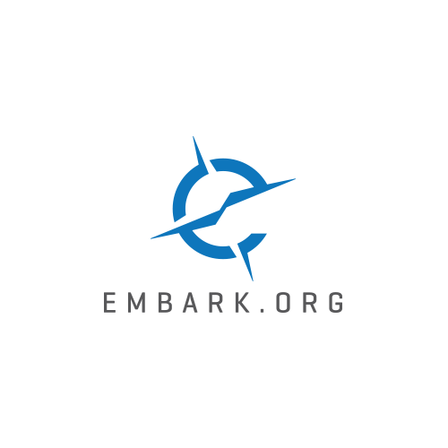
Embark helps people find adventure, and their logo is going to guide them there - it includes their website and an image representative of a compass. It is simple and direct, but full of possibilities.

Can you hear a logo? In the traditional sense of the word, no. Probably not. But with the wave length within the F, and the bold-unbold-bold beat of the website underneath, it's not crazy to consider that people might get a sense of sound when looking at this music logo.