
If you’ve been around WordPress, you know that there is a plugin for everything. Like Cornify, which makes unicorns dance on the screen after 5 seconds of inactivity, or Joy, a plugin that has the capability to swap all your fonts for Comic Sans. (We aren’t endorsing either of those. But, hey – you do you.) What we are here to talk about is a plugin that makes fundraising super easy. ClassyPress Pro.
ClassyPress Pro lets you create an awesome campaign that will help get amazing results for people in need around the world. While the results, speak for themselves, we wanted to give you some tips on how to make the most of it. We’ll cover the basics of how to make a campaign page on your website that will get you more donations, including using a compelling benefit-driven headline, sharing your mission, and using social proof to boost your campaign.
Note: If you don’t have it yet, you can purchase ClassyPress Pro or download the free version.
Let’s get started!
Some Quick Definitions
Before we get started, let’s nail down some of the marketing jargon we’ll be using in this guide.
Landing Page
Your campaign page is an example of what’s known in the marketing world as a “Landing Page.”
While there are all sorts of landing pages used in all sorts of ways, they’re basically any page on your website dedicated to generating sales of a specific product – or in your case, donations for your fundraising campaign.
Landing pages have a few major differences from other pages on your site, like very deliberate “Calls to Action”, and especially powerful “Headlines.”
(More on these below.)
Headline
“Headline” is just the fancy marketing term for the title of your campaign page (which might be the same as the name of your campaign).
If you’ve ever read a newspaper, the large, bold text at the top of every article is the headline. When creating a campaign page, it is what grabs the viewer’s attention and encourages them to keep going.
Call to Action
A “Call to Action” is just like it sounds – it’s something you use to tell visitors to your campaign landing page what they can actually do to help you out as opposed to what your nonprofit’s mission to helping is.
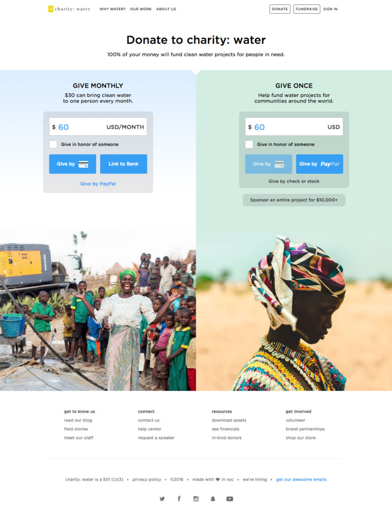
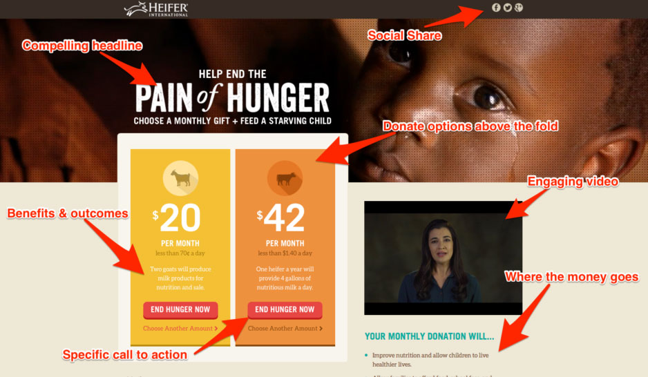
On your campaign page, you’ll use calls to action (or CTAs) usually in the form of “Donate” buttons – just like in the landing page photo above.
This may seem like just another way of saying “button,” but calls to action are a really important part of your campaign page and have some special rules to make them work well for you (read: get you more donations!), unlike other buttons you might have on your website.
Copywriting
Copywriting is just a fancy marketing term for writing that’s meant to persuade a reader into taking a specific action (like donating to your fundraising campaign!). When we refer to “copy,” we are just talking about the words on the page.
Alright, with all that out of the way, let’s move on to the good stuff!
Creating a Campaign Page with ClassyPress
As we said before, the purpose of a campaign landing page is to help you help those in need. While there are a lot of elements to creating an awesome fundraising campaign, one of the most important is having a really awesome campaign page that makes people want to donate.
Of course it’s important to promote your campaign through social media, advertising, and word of mouth, but all that work will be for nothing if it’s not easy for people to understand what it is you are doing, why they should care, and how to help you!
With that, let’s get into some general guidelines for creating a campaign page, then we’ll show you how to structure your page and what to include to get as many donations as possible.
General Guidelines
Professional copywriters use a “swipe file,” which is basically just a big folder filled with headlines, landing pages, calls to action, and all sorts of other examples of copy that has been proven to work.
You might not be a professional copywriter – and probably don’t want to be – but by following their lead (and the tips we provide in this guide) you’ll be able to get much better results by “copying” what already works without having to spend years learning.
So with that let’s get into our first tip:
Make it easy for people to help you out!
That seems like a simple, obvious statement, but it’s probably the most important rule of marketing.
The goal of every part of your marketing campaign and copy is to persuade people to take action, which is ultimately about overcoming their internal resistance by using emotionally compelling messages and otherwise making it as easy as possible for them to take the action you want them to.
When it comes to your fundraising campaign, the two key actions you want people to take are making a donation and/or spreading the word on social media.
The harder it is for people to understand what it is you’re doing and how to help, the fewer people will do so, and that fact should inform every part of your campaign marketing, especially your campaign page.
Which leads us to tip number two:
Visitors should be able to learn 3 things within 5 seconds:
When they make it to your landing page, they should quickly know what your campaign is about, why they should care, and what the next step is that they should take to help.
In a high-speed, short-attention, social media world, it’s important to communicate quickly with visitors to your campaign page in order to grab and keep their attention. It’s the only way you’ll have a chance to convince them to donate. So as soon as someone visits your campaign page, make sure they can quickly figure out what your fundraising campaign is all about, why they should want to help, and how they can donate.
You’ll do this by including a compelling benefit-driven headline, a short video explaining your project, and donate button at the top of your campaign page. We’ll talk more about that later.
Now let’s talk about your landing page design.
Effective Landing Page Design
Remember, the main goal when creating a campaign page is to persuade people to take action in the form of donating, or at the very least sharing your campaign on social media, which you’ll do by keeping things simple, focused and emotionally compelling.
We have a whole blog post just about the design elements of a landing page over here, but these quick tips will get you well on your way to creating a great and effective landing page.
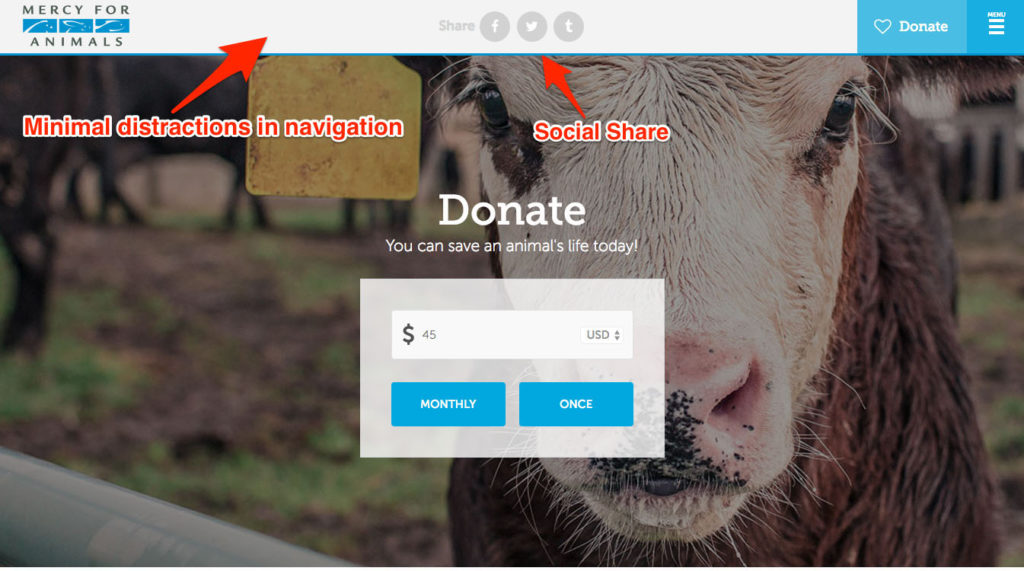
Minimize Distractions
Creating a campaign page that is simple starts with minimizing the number of distractions on your page.
Again, the goal is to make things as simple as possible while being able to share an emotionally compelling message with the people who visit your page, and sticking as close to a one column format as possible is a good way to do this.
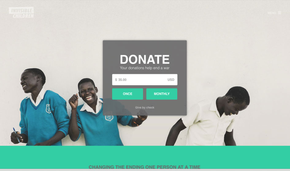
Include 2-3 Calls to Action
Remember what we said before, a Call to Action, or CTA is a simple, clear, and specific button or link that tells your visitors what to do next to help you out. It’s important to have one of these “above the fold,” which is just a fancy marketing term for that part of your page towards the top that people can see as soon as they land on it. This is how they’ll quickly and easily know what to do next if they already want to donate when they get to your page.
But for those who want to learn more about your campaign first by scrolling down the page, it’s important to add at least one other CTA closer to the bottom of your page so they don’t have to scroll back up to donate (remember: make it easy for them!).
For your campaign page, we recommend you use a button to make your call to action clear and easy to respond to.
One other important tip is to add some element of urgency to your CTAs. This means instead of your button just saying “Donate,” be sure to use “Donate Today” to add that extra bit of persuasion that will lead to more donations.
Limit the Length of Your Campaign
Another easy and great way to use urgency to get more donations is to limit the length of your campaign. While you might be tempted to run a long or ongoing fundraising campaign so that more people can donate, there are a couple of reasons why this won’t necessarily work.
The first is due to the law of diminishing returns: when you first launch and promote your campaign, you’ll see a huge jump in donations. As time goes on, though, those donations will inevitably drop off as the people who really want to donate do so. Eventually due to this, you’ll reach a point where the costs of keeping the campaign going will exceed the amount of donations you’re getting, which is obviously a good time to stop.
Urgency is also a powerful way to persuade people who are on the fence into donating. It’s always harder for people to donate than not, and if people see they have plenty of time to decide, they’ll put that decision off until tomorrow. And as the saying goes, tomorrow never comes.
When people see they only have limited time to help, they’ll feel that extra little bit of pressure to make the decision sooner, which will lead to more donations.
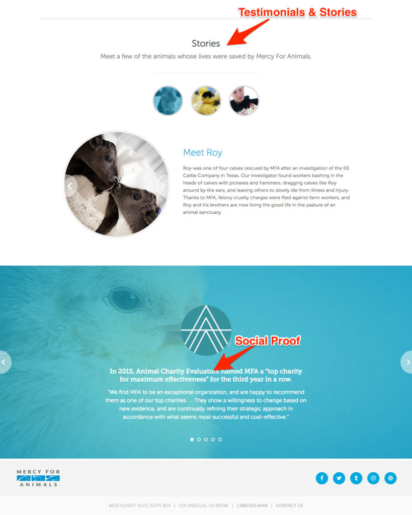
Include quotes from people you've helped
People want to know that their donation is going to have a meaningful impact in the world, and there’s no more powerful proof of that than quotes from people you’ve helped through your organization.
If you’ve done similar projects to the one you’re raising funds for, be sure to get pictures of and quotes from these people to include on your page, which will help create a human connection between them and potential donors.
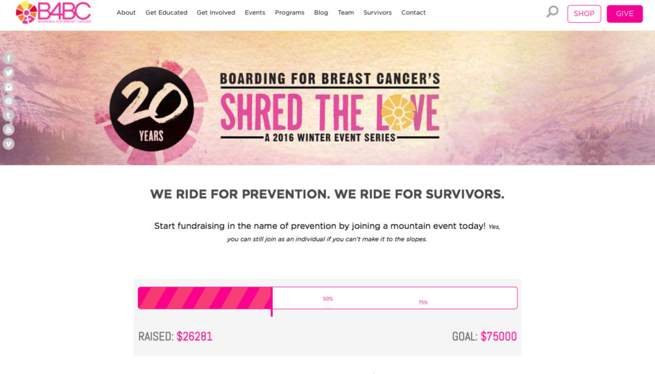
Use the ClassyPress Progress Bar
The ClassyPress plugin allows you to include a live progress bar that shows how much has been donated so far and how close you are to your goal.
When people see that others have donated, they’ll be more likely to donate themselves. And if they see you’re close to your goal, that might be just the thing that leads them to donate.
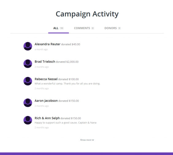
Use the ClassyPress Campaign Activity Feed
This is the next step up from the progress bar.
With the ClassyPress Campaign Activity Feed integration, every time someone donates or makes a comment about your campaign, you’ll be able to display it on your campaign page to show others everyone that has donated and what they had to say about it.
It is a great way to foster a sense of community among your donors, and give them that sense of pride that their good deed is visible.
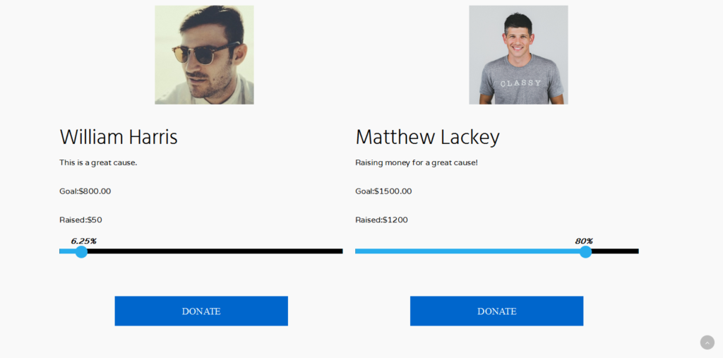
Use the ClassyPress Top Fundraiser Integration
To take your social proof one step further, use the ClassyPress Top Fundraiser integration to highlight your campaign’s top donors. Not only is this a great way to thank those people for their contribution, but it will inspire others to do the same.
A Simple Campaign Page Structure and Formula
Alright, now that we’ve shared some design and formatting tips and tricks with you, let’s start getting a little more specific about how to create an awesome, persuasive fundraising campaign page.
Remember when we talked about how professional copywriters copy formulas that are proven to work? We highly recommend you do the same to get better results from your campaign page without having to become an expert.
We’ll show you how to use a simple “1-2-3-4 Formula” when creating a campaign page that gets you more donations.
The formula is this:
What I've got for you
The first thing you want to tell visitors to your campaign page is what your fundraising campaign is all about and who you’re going to help with their donations.
This is where your benefit driven headline comes in.
As we mentioned before, your headline is one of the most important parts of your page, because people will decide to read more or leave depending on what your headline says. While this could be the same as the name of your campaign, sometimes it’s better to separate these as the message for each can be slightly different.
You really want to be sure to convey the benefit you’re going to be able to deliver if people make a donation.
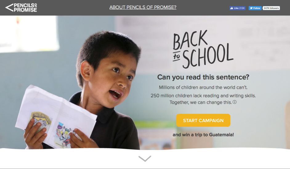
Starting your headline with verbs like “Help,” “Give,” or “Sponsor” to let people know what their donation really means. And be sure to place your headline over an emotionally compelling image to help evoke a desire to help in your visitors (like in the example above).
How it's going to help (why you should care)
This is where you go into a bit more detail about how you’re going to deliver the benefit you’re promising in your headline and elaborate a bit more about your project.
Immediately underneath your headline try to include a short (around one minute long) video, describing what it is you hope to achieve with your campaign and how you aim to do it. If you don’t have the time or resources to make a video, that’s okay, but with attention spans getting shorter, more and more people are watching video, and it’s one of the most powerful ways for you to quickly share your message in an emotionally compelling way.
Whether you use a video or not, be sure to also include your campaign progress to provide social proof and your first call to action to tell people how they can help right away.
Your headline, video, progress, and first CTA should all be “above the fold” at the top of your page.
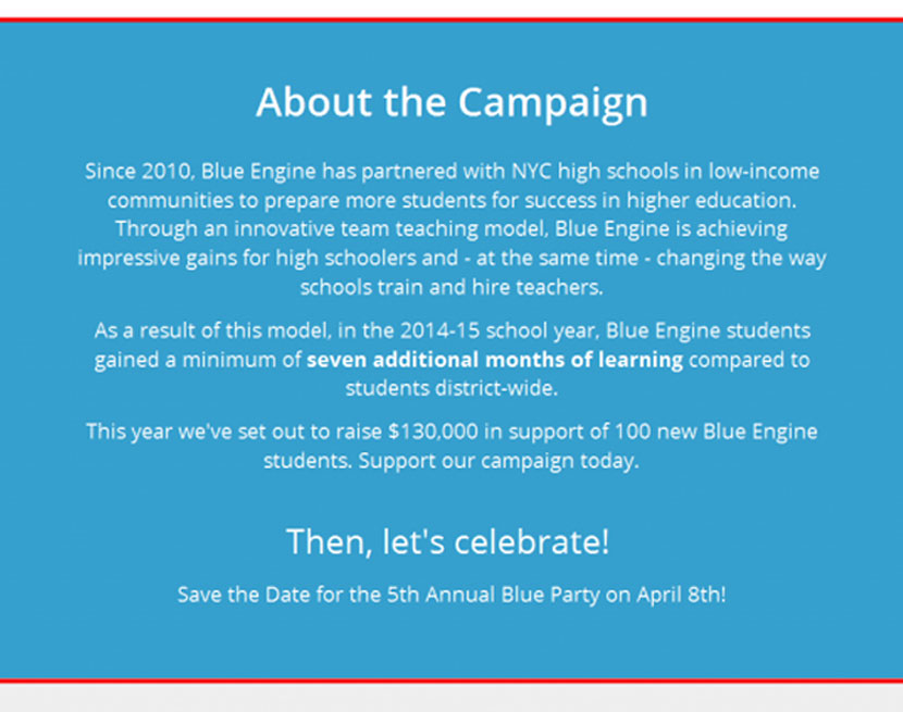
Next, go into a bit more detail about the project with a short “About the Campaign” section, where you describe again what your project is about, what benefit you’re going to provide, and how you’re going to do it.
In this section, be sure to answer questions like:
- What are the greatest benefits of donating?
- How will people’s lives be better through your project?
- How does your project help the donor reach the goals that matter most to them?
Finally, be sure to include a “Get Involved” section.
Create different recommended donation levels, and tell people what you’ll be able to do if they donate each amount. Don’t forget to include the sense of urgency along with it!


Who am I?
Whether this step is needed depends on your relationship with the people visiting your campaign page.
If you’re driving traffic to your page through Google AdWords (we’ll talk a bit more about this later), you’ll definitely want to include a section like this. Here is where you’ll establish your trustworthiness and ability to deliver the benefits you’ve promised through your project.
Briefly describe your organization, your mission, how long you’ve been around (if you’ve been around a while), and why you’re raising funds through this campaign. Then use more of that social proof we mentioned above by including quotes and pictures of people you’ve helped in the past, as well as a Top Donors section.
What you need to do next
After you’ve told people what your campaign is all about, how their donations will help people in need, and who you are, be sure to include one more call to action near the bottom of your page to give them another easy prompt to donate if they’re ready.
After you’ve got all those sections in place, at the bottom of your page be sure to include a “Campaign Activity” section using theClassyPress plugin to provide one last bit of social proof to reinforce your trustworthiness, ability to make your project a success and give people an opportunity to share their thoughts.
If you’re landing page has a footer section, be sure to keep it as simple as possible like with your menu bar as we mentioned above.
Benefits of Using ClassyPress on Your Website
Now that we’ve shown you how creating a campaign page with intention will help you get more donations, let’s go over a few reasons why it’s important to create a page like this on your website, rather than simply linking to your page on the Classy.org website.
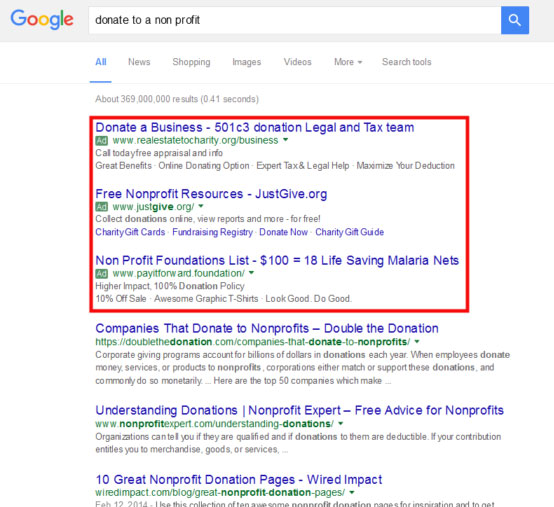
Google Ad Grants
Perhaps the most important reason is the Google Ad Grants program.
In case you haven’t heard, 501c3 nonprofits are eligible for $10,000 in free AdWords advertisements per month (those are the text ads you see at the top and side of Google search results).
One of the limitations of these grants is that the ads can only link to your website, which means you can use them to drive traffic to a campaign page on that’s on your website, but can’t use them for your Classy.org page.
Data Collection
The ClassyPress plugin allows visitors to your campaign page that decide to donate to enter some of their personal information right on your website, rather than just on Classy.org. This allows your organization to collect names, email addresses, and even donation amounts of everyone who donates using the page on your website.
With this information, you can stay in contact with your donors to thank them for their donations, update them with the latest news about your project and organization, as well as segment your donors by data like donation amount to more effectively market your next campaign.
Search Engine Optimization
Search Engine Optimization or SEO is basically a set of tactics and techniques that help you get more traffic to your website by increasing your visibility in search engines “organically” (read: without paying for ads).
While this is a monster of a topic within itself as there are many factors that determine your search engine rankings, there are three main reasons using ClassyPress when creating a campaign page on your site will improve your SEO.
For all these reasons and more, the SEO benefits of having your campaign page hosted on your website using ClassyPress means you’ll be getting more visitors to your site!
Consistent Branding
When we are talking about nonprofits, the idea of “branding” sometimes gets overlooked. It is true that your mission is the most important, but in order to help more people, you need to come across as consistent and professional. ClassyPress Pro helps you do just that.
You can incorporate all the visual elements that exist in your other marketing materials so that you have total consistency. Existing donors and supporters who come to your landing page will feel at home, and new supporters will recognize your organization when they come back again and again.
Ready, Set, Go!
Now that you’ve got a basic understanding of creating a campaign page that will get you more donations using ClassyPress, it’s time to get to work!
We hope you’ve found this guide useful, but we’re here for you if you need any additional help. Check out our ClassyPress FAQ & Support page, or contact us.