You don’t want your website to simply be “good enough.” If you are handling a nonprofit’s website design, email newsletters, or any other promotional material, then it’s likely that you’ve invested a good amount of time trying to figure out ways to keep your audience engaged. The longer your audience stays on your page and reads through your content, the better your chances of attracting more donations through your campaign.
Using the right font is particularly important for nonprofit organizations when trying to create awareness about a problem and attract more donations for the good cause. According to Mikael Cho, the co-founder of Oomph, fonts have a definite impact on the psychology of the audience.
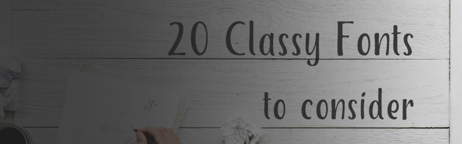
To make things easy for you, we’ve listed out 20 fonts that will help you engage & build your nonprofit audience:
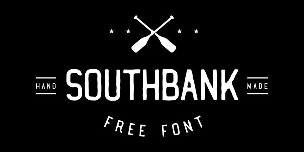
1. Southbank
If you are looking for a neat and simple font that is professional as well as appealing to the eyes, look no further than Southbank. It’s widely used by logo designers. If you like it, just download it for free and start using it.
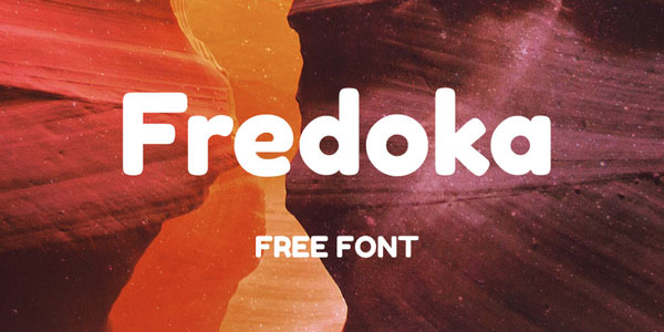
2. Fredoka
Here is another beautiful font that is big and bold and comes with rounded edges. Make your images look more engaging by using the font. It can be downloaded for free which makes it a great choice for nonprofits that are looking to make an impact visually.
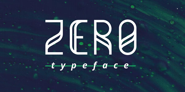
3. Zero Typeface
This one is totally different from the other fonts we’ve seen. It is a typical sans serif font that integrates both geometric and grid based style. Whether you are looking for an eye-catching font for your logos, headers, or brochures, Zero Typeface can be a great choice.
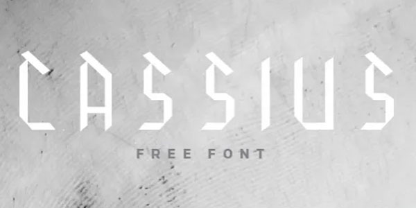
4. Cassius
Here is another font that is different from the regular fonts that are used in websites. If you are willing to take the bold risk in trying something different from the usual sans serif variations, try Cassius. Every letter will have a slanting line on its head, so it might just be the font you want to try to capture the attention of your nonprofit’s audience.
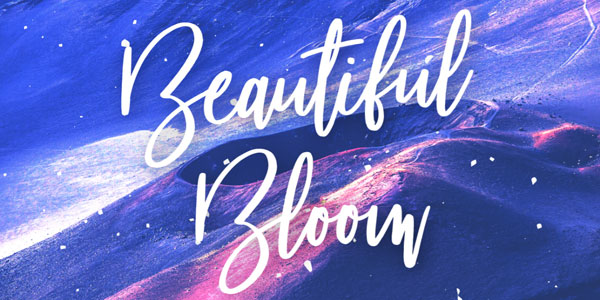
5. Beautiful Bloom
Sometimes, it makes sense to do an A/B testing with a cursive style font like Beautiful Bloom. You can use this font to give content on your nonprofit’s webpage a unique look and feel. Please note that this font was previously called Spiffy McGee and King Basil.
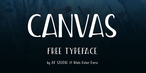
6. Canvas
Canvas makes your content look more elongated and bold, and it is more appropriate for headings and titles than the regular content.
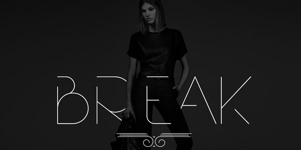
7. Break
Introduced by Rajesh Rajput, Break typeface is a classy font that comes with breaks in between letters to give a unique touch to your content. It can be used to display text, numbers, and symbols.
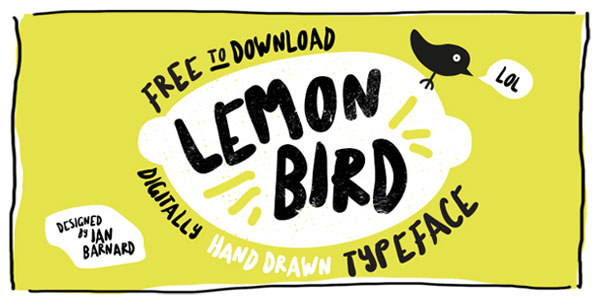
8. Lemon Bird
Lemon Bird is my personal favorite in the list. If you are looking to add little fun to your writing, try using this font. It’s more suited for casual websites, blogs and newsletters, but is not the best choice for professional websites.
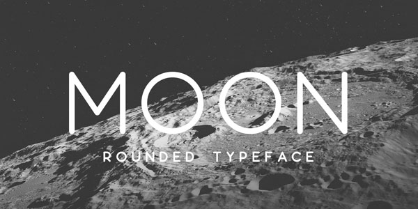
9. Moon
Introduced by Jack Harvatt, Moon is a simple rounded free typeface font that is available for personal and commercial use. Because it is clean and elegant, it’s commonly used in resumes and slogans.
10. Peace Sans
Here is a font that can make your content look calm and relaxing – just the thing your readers want when they are stressed out. Peace Sans shows the letters in neat curves and shapes, and is ideal for websites, logos, brochures, and presentations.

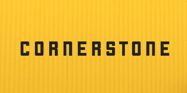
11. Cornerstone
Cornerstone is a unique choice for websites, but if you like to experiment with new fonts, this might be a great one to consider. It’s an all-caps type font introduced by Zac Freeland.
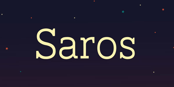
12. Saros
Why not use a traditional 1930’s font to give a classic touch to your content? Saros is a standout font that makes even small size content easily readable. It is ideal for both online and offline promotional materials.
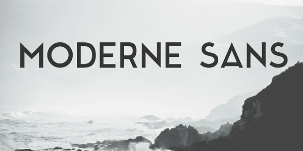
13. Modern Sans
Modern Sans is another popular sans serif font commonly used by web designers. It was first designed in the 1920’s and helps show content in uppercase and lowercase legibly and clearly. It’s available for both personal and commercial use.
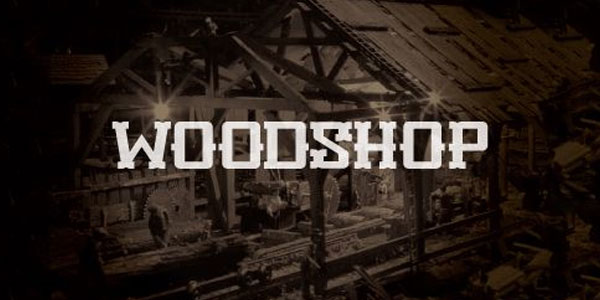
14. Woodshop
Giving a woody look to text font is something you wouldn’t have commonly heard of. But that is what the woodshop font is all about. It’s unique, catchy, and attention-grabbing.
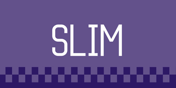
15. Slim
If your nonprofit’s website is loaded with thick and bold fonts, what you might need is something like Slim to offset your content visually. Use it in mild promotional content like social media posts.
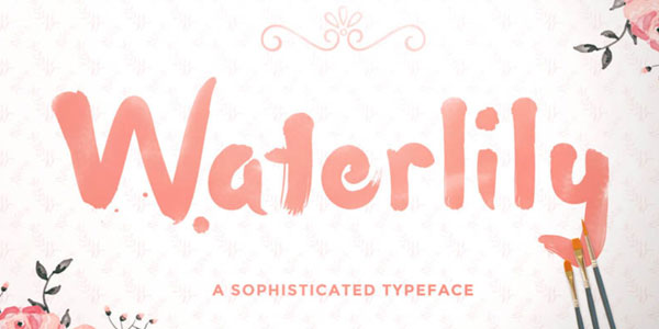
16. Waterlily
Free Waterlily is a hand-drawn design that makes your content look like they’re written using watercolor painting. It is unique, stylish, and beautiful. Use it for personal and business purposes.
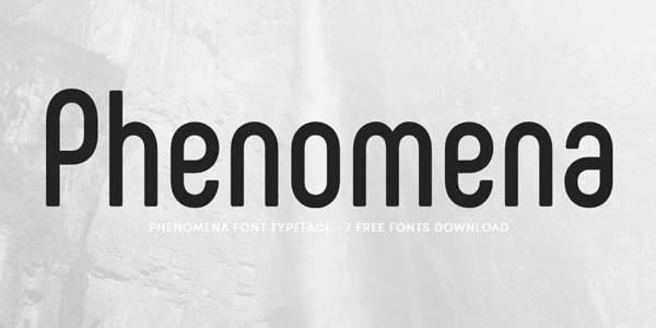
17. Phenomena
If you prefer big, bold fonts with rounded corners, then Phenomena could be a great choice for you. It’s an improved variation of sans serif. It comes with over 500 glyphs and is available in many languages. The font is available for personal and business use so you can go ahead and use it in your website for enhanced symmetrical aesthetics.
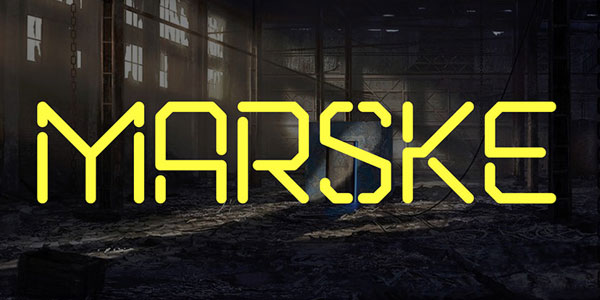
18. Marske - Stencil Font
Stencil fonts are a beautiful way to display the to-be-highlighted text in a website for a nonprofit. The font was introduced by Sergiy Tkachenkoand from Russia and later improvised by Kash Singh. People use Marske stencil font most commonly in books, brochures, and covers.
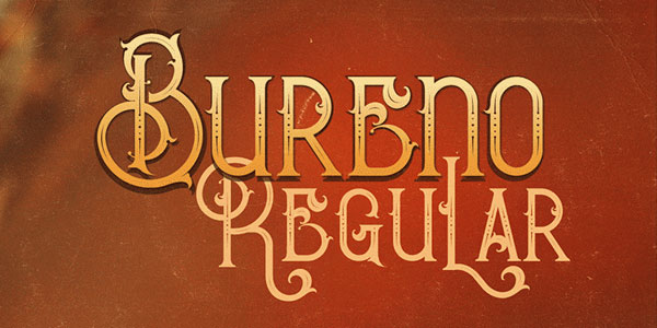
19. Bureno
Bureno is a decorated signature font that many people use on their websites and images for social media promotions. Even in its simplest form, it sports an artistic look that makes it a great fit for website headers. It’s ideal for both personal and business use.
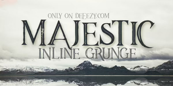
20. Majestic Inline
Majestic Inline is a special and creative font that makes ordinary content look extraordinary. It is more appropriate for headings and titles, not just in websites but also in printed documents. If you like it, click on the download link and start using it without any worry.
Here are some tips to improve your font choices:
When you’re working for a nonprofit or creating a website in any industry, it is important to think carefully about your audience. The last thing you want to do is exclude people or make them feel unwelcomed by utilizing fonts that are difficult to decipher. Be creative and memorable, but stick with fonts that are easy to read.