
Here at Mittun, we spent Giving Tuesday donating to many worthy causes across the country. While we support their missions, it was also part of a research project with the goal to decode what works in fundraising and what doesn’t – especially when it comes to a great donation page. In this ever-changing industry, and certainly as we go into 2021, we want to ensure we are always building the most effective websites and fundraising tools so nonprofits can do the most good.
Take a look at what makes each one stand out, and where there is opportunity to give their fundraising efforts a boost.
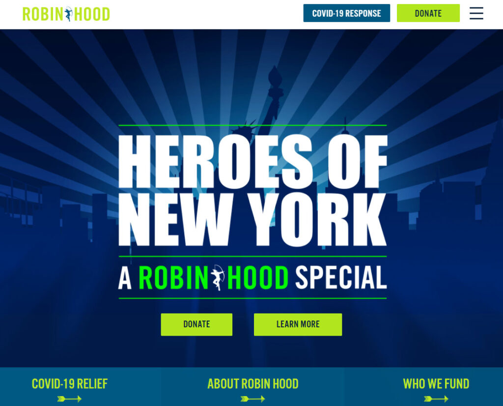
Robin Hood
Robin Hood has been fighting poverty in New York for over 30 years. It is clear from the very start that they know a thing or two about fundraising.
What Impressed Mittun
Check out this Opportunity
Robin Hood uses Classy to collect donations – off to a very promising start. But with ClassyPress, they could enhance the experience with loads of fundraising tools. As I browsed the site, I saw how much data they use to back up their efforts and impact. With ClassyPress, they could add additional fundraising features using that data.
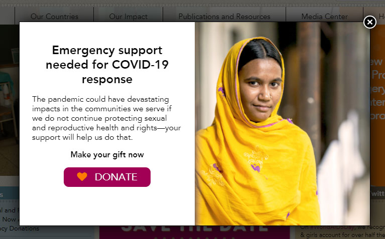
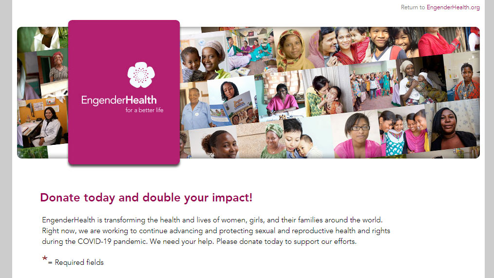
EngenderHealth
EngenderHealth is working for “a gender-equal world where all people achieve their sexual and reproductive health and rights.” Their fundraising efforts have enabled them to work with people in thousands of facilities across more than 100 countries.
What Impressed Mittun
Check out this Opportunity
The site design is very busy above the fold due to such a short scrolling page, making the user journey more convoluted. The donation form was also not mobile friendly. While the content and story told by EngenderHealth is incredible, an updated design could improve donations, especially among Gen Z.
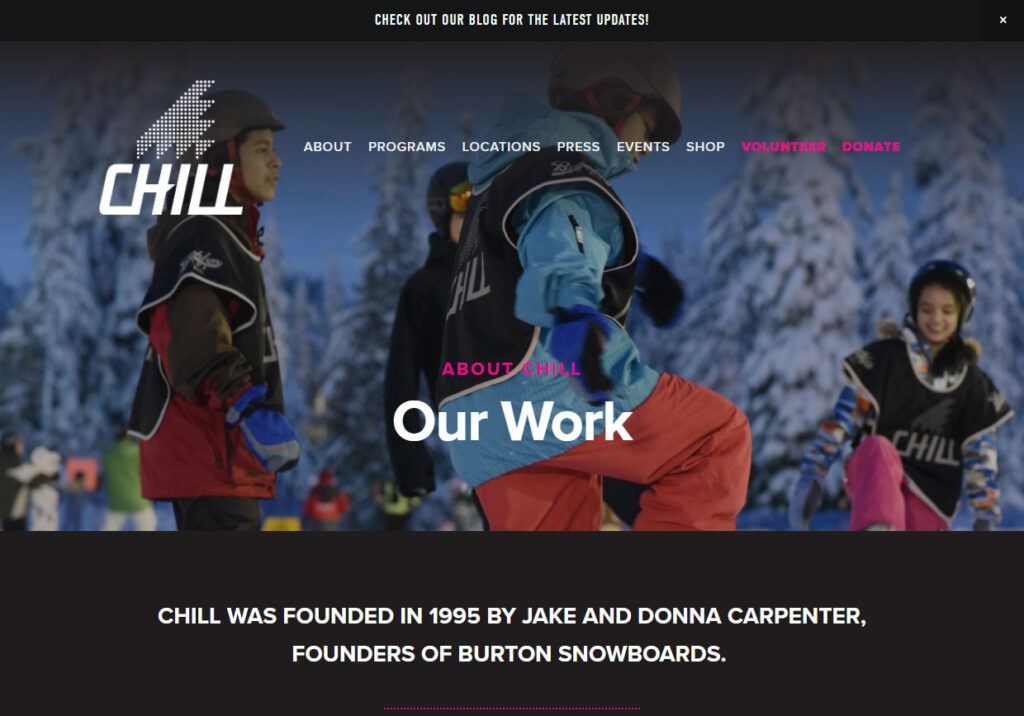
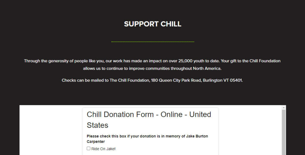
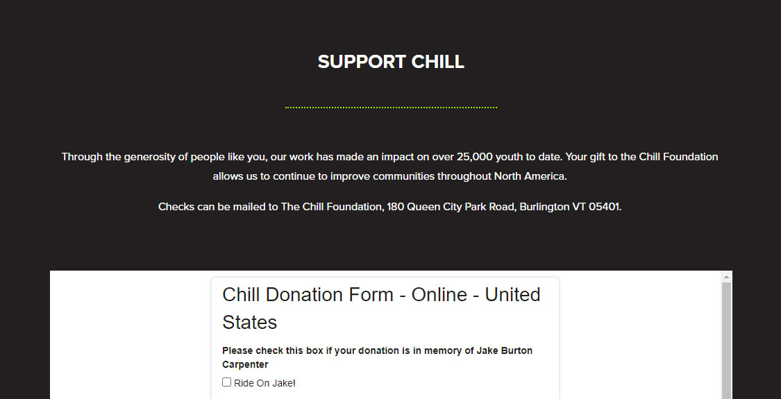
Chill
Chill is a “positive youth development program where boardsports become a vehicle for empowerment.” Chill definitely hits you with the cool factor (Get it? Chill = Cool) as soon as you land on their homepage, but they take their mission very seriously.
What Impressed Mittun
Check out this Opportunity
Their embedded form is a little clunky and looks outdated. Upgrading the donation process to a more seamless solution would mesh with the cool vibe of Chill.
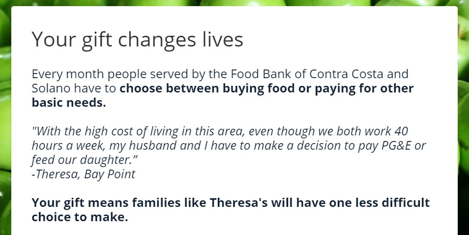
Food Bank of CCS
The Food Bank of Contra Costa & Solano has been helping to fight hunger for over 40 years. The community’s need for their services is heightened in the time of COVID, and their website can be a driving factor in providing food security to many people.
What Impressed Mittun
Check out this Opportunity
The navigation of the site was not the most user friendly. After clicking “Donate” from the hero on the home page, it led me to another page where I again had to click “Donate.” While it may seem like a minor inconvenience, making the process as smooth as possible invites more donors.
Also, as with several nonprofits, they utilize Classy. Upgrading to ClassyPress opens up so many more possibilities in fundraising.
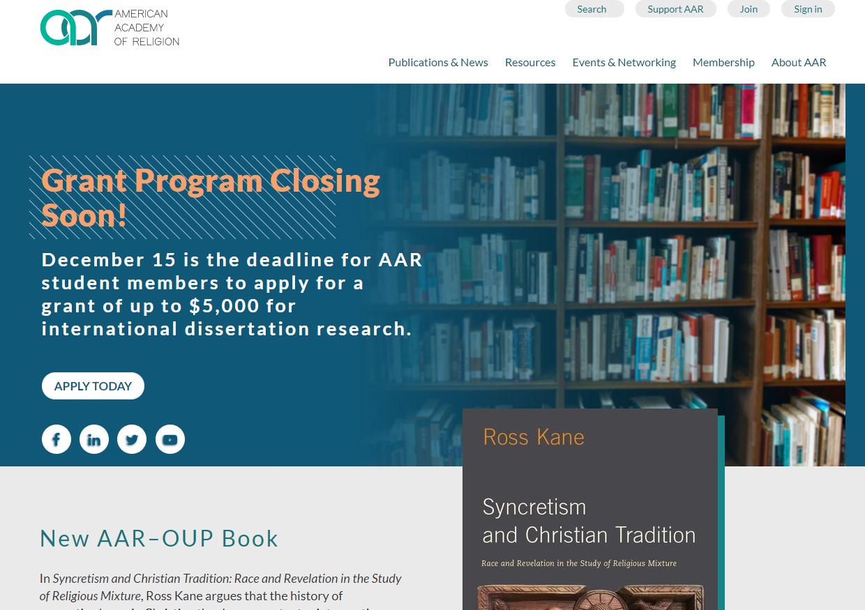
American Academy of Religion
The American Academy of Religion is on a mission “to foster excellence in the academic study of religion and enhance the public understanding of religion.” The site looks professional and academic, and the donation process was no different.
What Impressed Mittun

Check out this Opportunity
The home page isn’t focused on gathering donations, which is completely fine if the goal of the site is not to promote a campaign. But it wasn’t the most intuitive to navigate to the donation page for those who want to support them. Adding a clear button or dropdown in the menu could elicit more support without drawing attention away from the goal of the site.
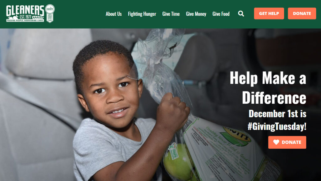
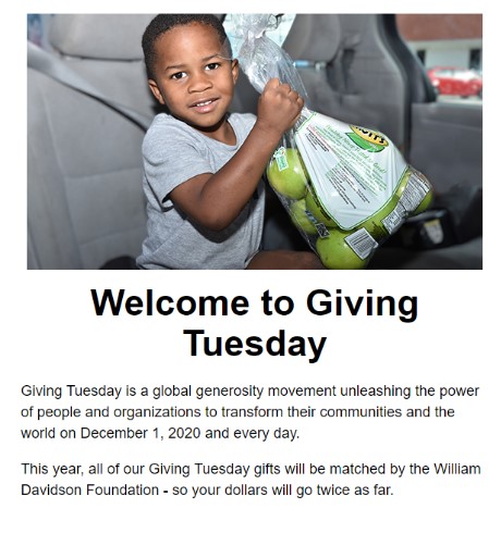
Gleaners Community Food Bank
Gleaners Community Food Bank has a vision of ending hunger in Southeast Michigan. Based in Detroit, they have been helping provide nutritious food and other resources to those in need since 1977.
What Impressed Mittun
Check out this Opportunity
While the process to donate was smooth and clear, it didn’t encourage a lot of interaction. The confirmation email and the page redirect thanked the donors, but didn’t offer additional opportunities to give (time or money) or further educate the donor on the community need and their impact. Adding links to other relevant content on the site can help engage the visitor and lay the groundwork for them to become a repeat donor.
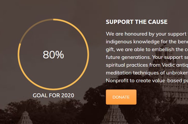
Hansavedas
The Self Enquiry Life Fellowship is focused on preserving indigenous knowledge from the Sanskrit heritage and inspiring those interested in enlightened living. The generosity of the organization is evident from every aspect of their site.
What Impressed Mittun
Check out this Opportunity
Unfortunately, it isn’t clear how to donate initially. In the navigation menu, you must go to “Participate → Donate” or scroll down to the bottom of the page to get to the “donate” button. While the mission is always front and center of any nonprofit, you don’t want to miss the opportunity to gain supporters so you can do more good!
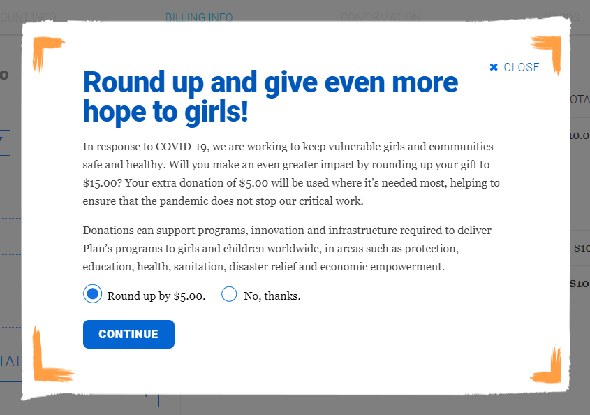
Plan International
Plan International wants to make the world a better place by advancing children’s rights and equality for girls. With a clear donate button in the menu and a call to action in a motivating hero image, PlanUSA checked all the boxes.
What Impressed Mittun
Check out this Opportunity
The method of payment is more like a shopping cart instead of a donation. Because of that, it says “Congratulations” after making the donation instead of a “Thank You.” The transaction process is similar, but the feeling the user has on being congratulated for a purchase and thanked for helping make a difference is distinct. Switching up the language could encourage repeat donations.
Faith in Practice
Faith in Practice serves “the poor of Guatemala through short-term medical mission trips that take an integrated approach to care that strives to reach those in the greatest need.” Their teams see nearly 30,000 patients each year thanks to donations and volunteers.
What Impressed Mittun
Check out this Opportunity
While they have a clear “Ways to Give” button at the top of each page, it doesn’t take you directly to a donate page. The other options for getting involved are all important and necessary, but streamlining that top button could ease the process for many donors.
Their forms are also powered by Classy! By upgrading to ClassyPress, they could take each campaign to the next level and invite donors to be a part of their journey.
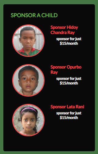
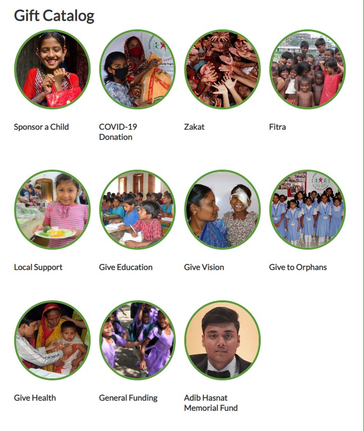
Distressed Children
Distressed Children “looks forward to a day when no child is left behind because of lack of resources and opportunities to develop his/her full potential.” Between the success stories and achievements listed on their site, they build confidence between the donor and the mission.
What Impressed Mittun
Check out this Opportunity
On their donation page, you are given a plethora of options. You can choose to donate based on cause or by country. You can learn the names of children to sponsor. You can choose to gift school supplies, hygiene products or clean water. It was enlightening to learn what was needed and the costs, but it took a bit of digging to find where to give a general donation. These options should not be taken away, but a general donation option at the very top could alleviate some of the confusion.
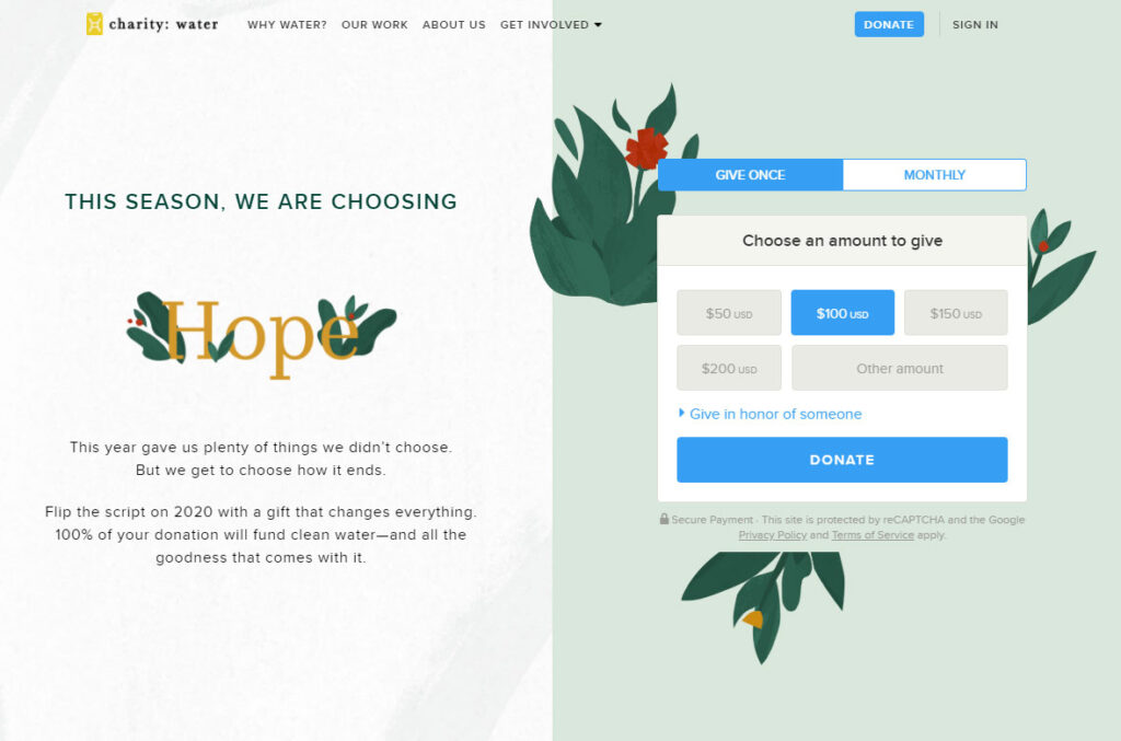
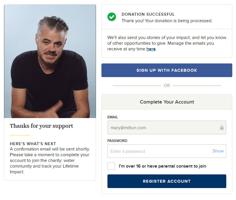
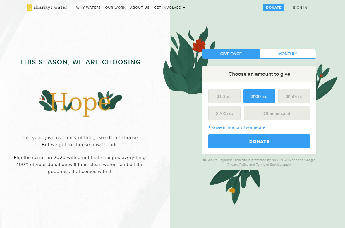
Charity: water
Charity Water brings clean and safe drinking water to people in developing countries. And in terms of their donation process, they really nailed it. From their front and center donation form, to the multiple emails offering thanks and interaction, it was an engaging experience.
What Impressed Mittun
Check out this Opportunity
While it is hard to find criticism with Charity Water’s donation process and their great donation page, they overlooked one detail – checking the links in the emails they sent. They had archived several of the blog posts, so the links in the emails sent me to a dead end. Just a good reminder to check and recheck every link, especially before big days like Giving Tuesday.
Key Takeaways
No matter your mission, no matter your goals, no matter your design – there are a few key takeaways from this research. Every online fundraising campaign and donation form should include these items:
What now?
Explore your own organization’s donation flow. Sometimes it helps to put yourself in the mindset of a new donor and do some “secret shopping” for your own nonprofit to see if you have a great donation page. Look at it with a fresh lens and evaluate every step of the process, asking yourself these questions.
-
Did I feel appreciated?
-
Did I receive a receipt that included information about tax deductions?
-
Do I know where my money went?
-
Was I engaged after the donation was sent?
Not sure where to begin on the audit process or how to revamp your donation flow?
We’ve got you covered.
Mittun is a premium website provider for nonprofits and mission-based brands. If you’d like some assistance with your website or donation flow, drop us a line.