The words on your website matter. They tell the story of the people you help, the mission you are on, and your organization’s goals for the future. They carry a lot of weight, and not to add more pressure, but you want to make sure your font choices are giving your site and its words the best chance of being heard.
We’ve shared some creative fonts for nonprofits to consider. Now here are a few tips, and our top choices for fonts in 2021.
We’ve seen a lot of fonts for nonprofits in our years as a website provider. Some have fallen out of favor to be replaced by trendy revamps, and others are here for the long haul.
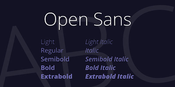
1. Open Sans
Some call it “the only font you’ll ever need.” Those of us who geek out over fonts for nonprofits disagree, but they have a point. It works great for print and digital. It is legible across any device. And with the options for various weights, you can be as delicate or bold as you need. We don’t say this about every font, but you really can’t go wrong with Open Sans.
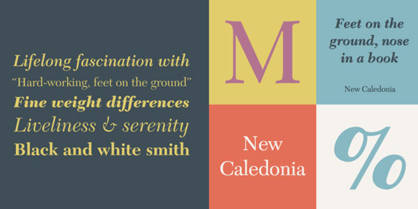
2. New Caledonia
Look out, Times New Roman. New Caledonia is taking over as the go-to classic. While it was previously used exclusively in print materials, it is gaining traction in digital formats due to its professional look. With it’s fine weight differences, it is ideal for large amounts of text but can add a touch of elegance when used as a header.
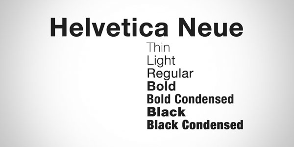
3. Helvetica Neue
In the 1980’s, the long-standing Helvetica font was redrawn. It took aesthetic and technical refinements into consideration, and Helvetica Neue became one of the most superior font designs to date. Its proportions make it an extremely legible and accessible font for any application, especially when the audience needs clear copy. So go ahead, use it anywhere you want in print and on the web.
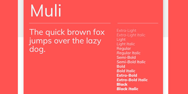
4. Muli
Muli is a minimalist font. It was created for web use and intended to be used as a display font – the font used for headers and heroes. With minimal strokes, it doesn’t make a great choice for large chunks of copy. But clean and to the point, it draws attention to the message.
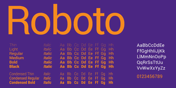
5. Roboto
When a font is designed by Google, it is bound to be good one. Roboto was designed in 2011 as a universal font for all devices – computers, phones, tablets and even smart watches were in mind when they created this curvy, geometric font.
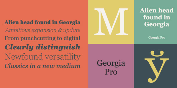
6. Georgia
Let’s get serious for a second. Georgia is a practical font. Some might even say formal and stable. It is easy to read no matter the resolution of your screen, and its classic look does not date your website. But if you want to have fun with Georgia, pair it with a lighter sans serif font for some contrast.
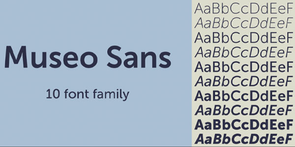
7. Museo Sans
This low contrast, geometric and highly legible font can be used for display and copy use. For as simple as it is, Museo Sans doesn’t come across as classic. It is a friendly font that changes tone depending on the weight you choose.
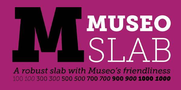
8. Museo Slab
Meet Museo Sans’ older sister, Museo Slab. This is the more robust serif version that was designed several years earlier. While it is just as friendly, it has a more classic feel with the serifs. Combine the two Museos in your web design, and you’ve got a dynamic duo.
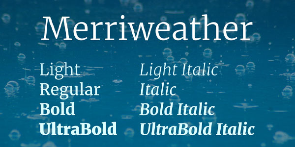
9. Merriweather
Are you getting Georgia vibes with this one? Merriweather aims to be a serif font to use across the board, as a header or copy. While it’s slightly more playful lines don’t lend itself to be used in large chunks of text, it is legible for nearly every other use on all devices.
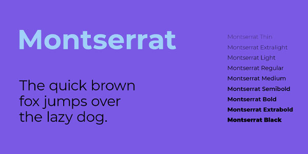
10. Montserrat
Julieta Ulanovsky was inspired by the old posters and signs in the Montserrat neighborhood of Buenos Aires when she designed this geometric font. It has a strong and modern look to it, and is a more unique choice than many of its sans serifs counterparts without sacrificing legibility.
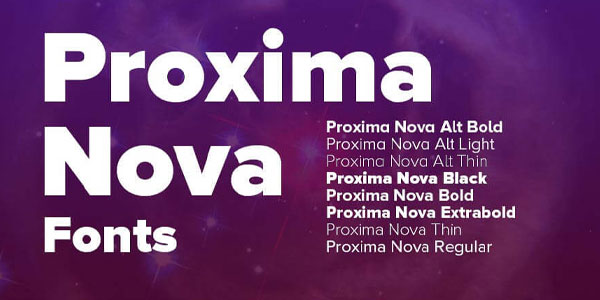
11. Proxima Nova
Proxima Nova is everywhere. Wired, BuzzFeed, Mashable, and other huge names use Proxima Nova – and for good reason. Putting aside the fact that its trendy (and I mean that in the best way), it was made to work well on screens, and its tone is very flexible. Many news outlets use it because Proxima Nova looks urgent and important, but doesn’t look out of place when paired with more light-hearted content. If your site tells many stories, this would be a great choice.
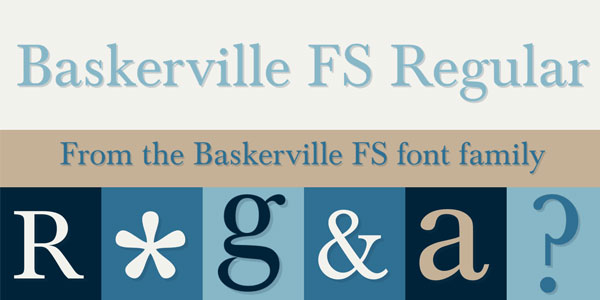
12. Baskerville
This is the oldest font on our list, by a long shot. First designed in 1754, it is safe to say that it was created for print materials. But its legitimate classic look and readability have made it popular for websites as well, especially as part of a branded look. Its crisp and classic look work well for elegant and refined styles.
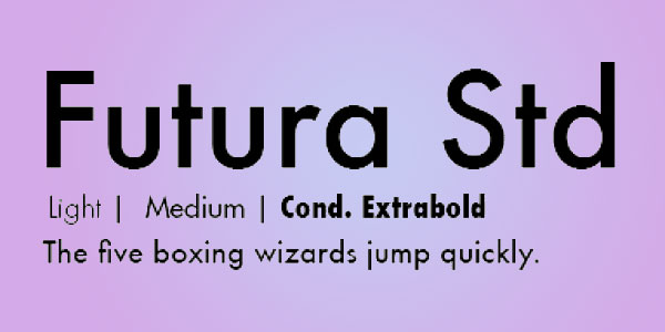
13. Futura Std
It’s kind of implied in the name – Futura is a modern font. While it is inspired by ancient Roman texts, Futura is taller, more narrow, and fit for the web. With several weight options to play with, this font can be used across the board.
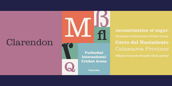
14. Clarendon Lt Std
This is not your mother’s serif font. While the serif adds that classic feel to Clarendon, it was designed to be more contemporary. It is clear and legible when used in web design, but translates well to print too. It is an all around good font when you’re looking for classic without going too serious.
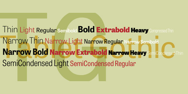
15. Tablet Gothic
Look at all that font variety. Tablet Gothic has a style for nearly every use. By adjusting the weight and emphasis, you can manipulate it for your website, print and even logo. It is sturdy, straightforward and clean – everything you would expect from a gothic font without losing its own personality.
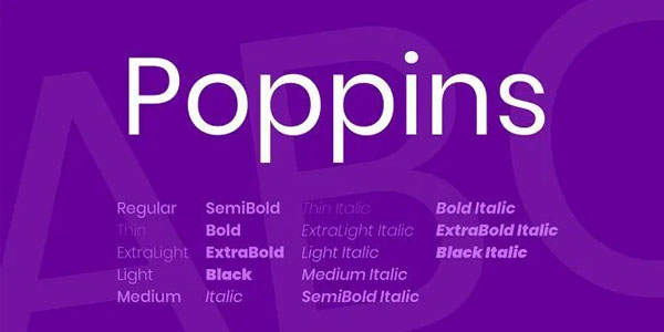
16. Poppins
Geometric sans serif fonts have been popular for a while, but Poppins is newer on the scene and brings with it a unique benefit. It has the same visual weight horizontally and vertically, and it is corrected at stroke joints to ensure a completely even color on the screen. It doesn’t get much more crisp than Poppins.
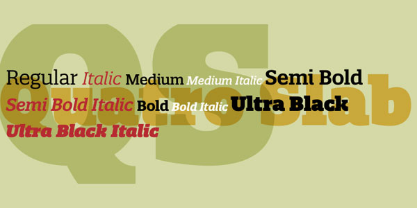
17. Quatro Slab
Quatro Slab seamlessly offers it all. Whether you want a playful font, a bold option, a serious one, or a modern tone, Quatro Slab will deliver. It’s rounded serif and unique letter construction allow it to evoke a wide variety of feelings.
When you’re working for a nonprofit or creating a website in any industry, it is important to think carefully about your audience. The last thing you want to do is exclude people or make them feel unwelcomed by utilizing fonts that are difficult to decipher. Be creative and memorable, but stick with fonts for nonprofits that are easy to read. Fonts certainly matter.
Don’t settle for “good enough” when it comes to your nonprofit website. Mittun is the premier website provider for nonprofits and has built many amazing sites. We know our way around fonts for nonprofits, and we are happy to answer any questions about your branding, website, or other digital marketing efforts.
What are your fonts saying about your nonprofit?
Contact Mittun for a free assessment today.