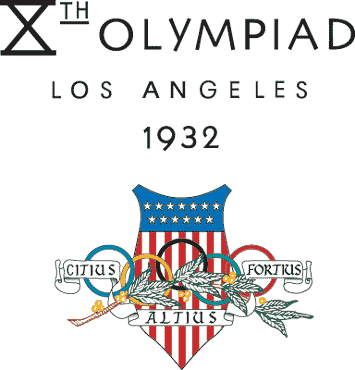
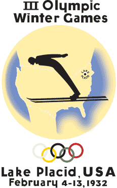
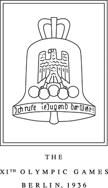
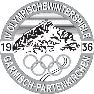
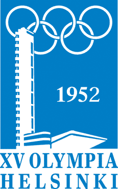
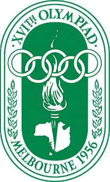
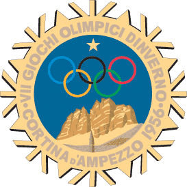
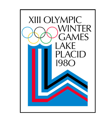
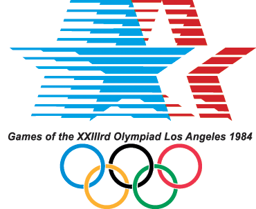
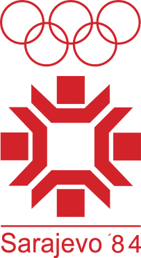
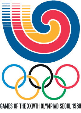
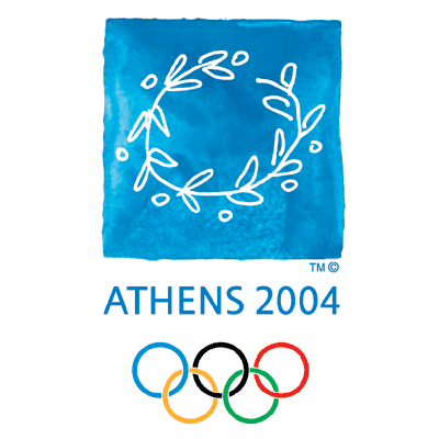
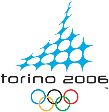
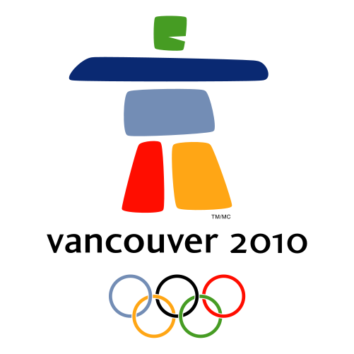
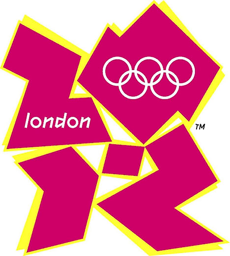
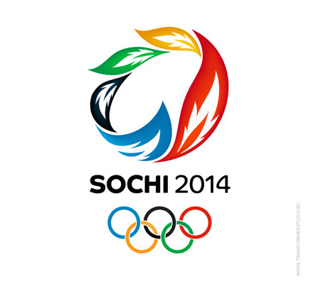
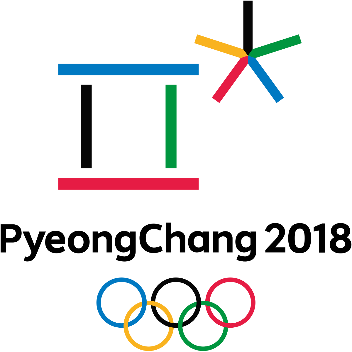
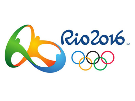
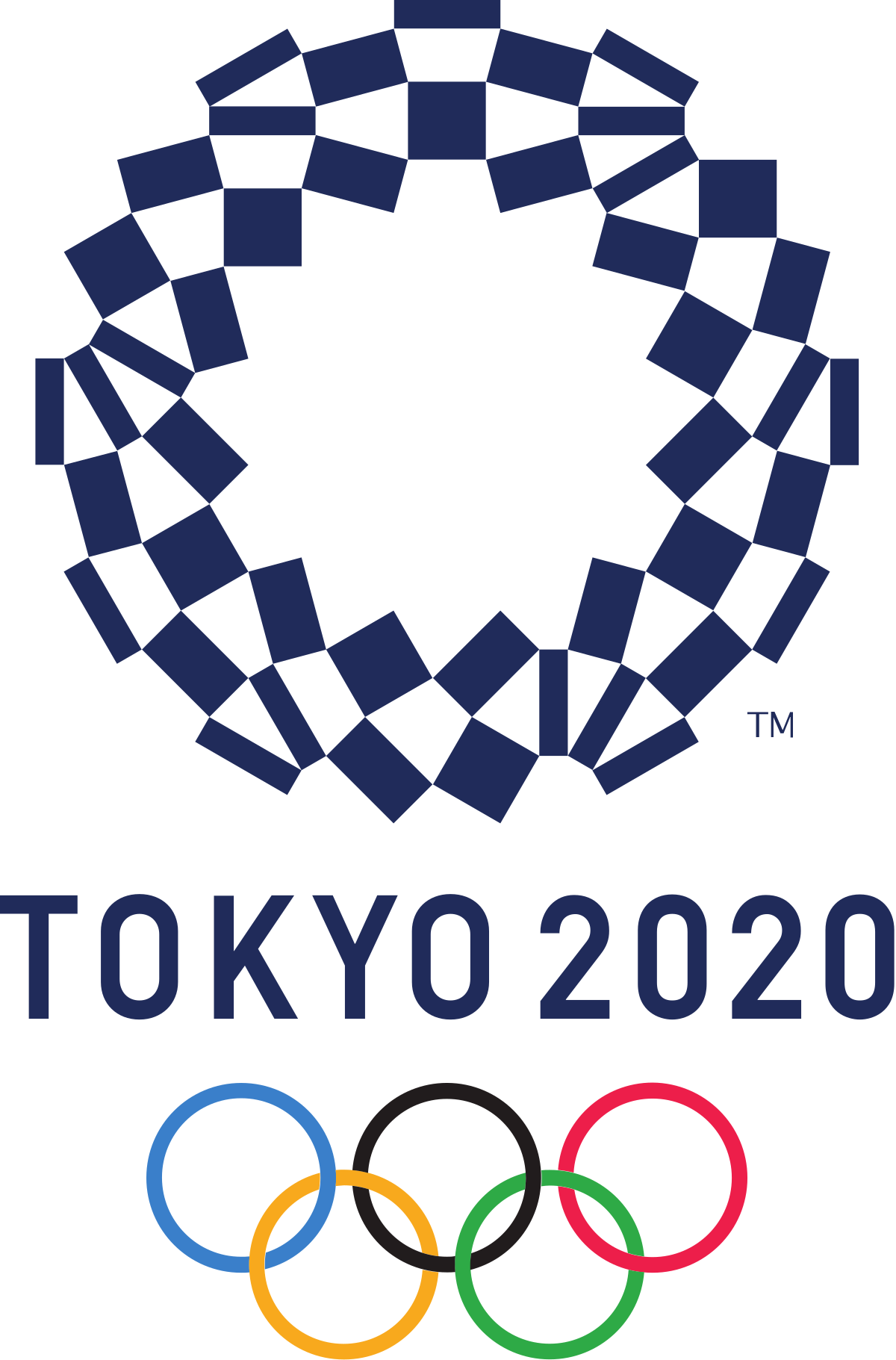
Want to take a trip through time? Here is a compilation of every single Olympic logo since 1932. And here are a few fun facts for you.
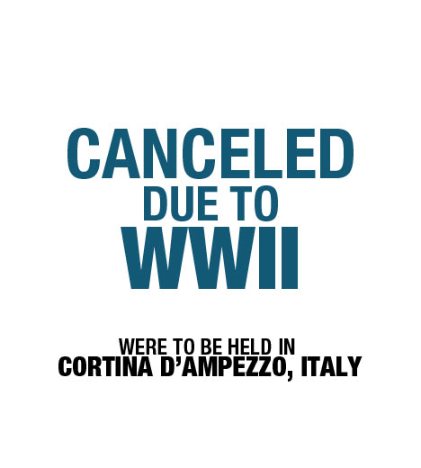
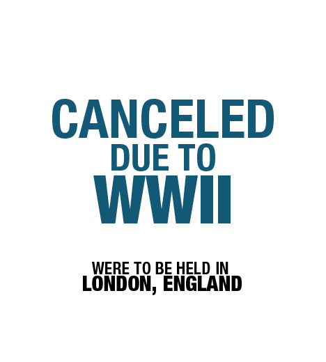
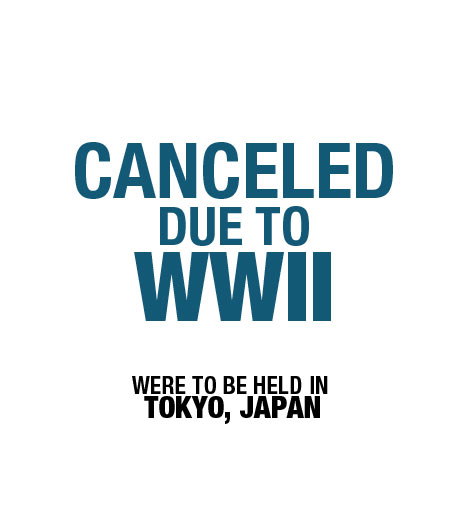
- Both the 1940 and 1944 Summer & Winter Olympics were canceled due to WWII
- Every Winter & Summer Olympics up until 1992 were held in the same year
- Every Winter & Summer Olympics since 1994 have been held in different years
- The most expensive Olympic logo (on record) is the most recent one, London 2012. This bad boy clocks in at over $600k.
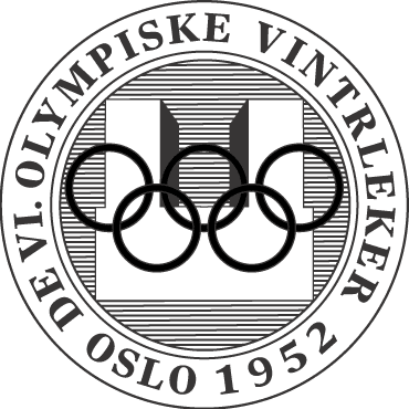
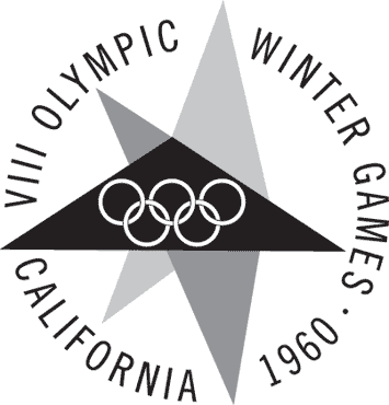
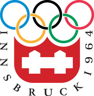
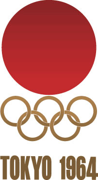
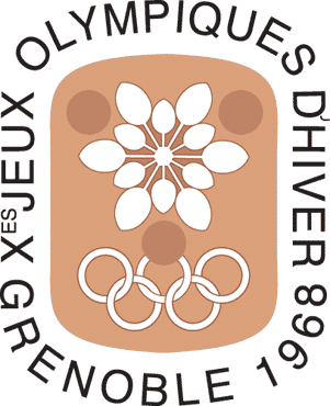
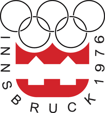
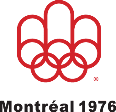
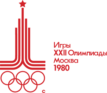
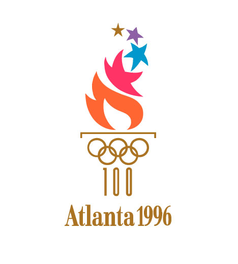
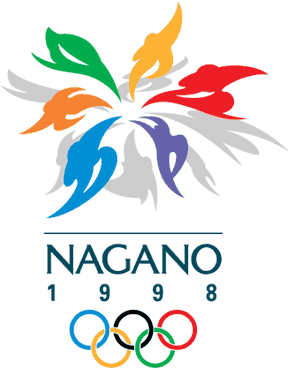
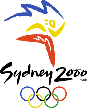
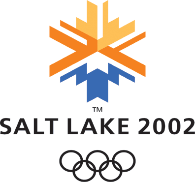
It’s interesting to note the trends of Olympic logos. It appears that they all must have the city, the year, and the rings. It’s also interesting to note the progression of design. It’s clear that every logo in the last 30 years is a bit more polished than previous years. The main reason? The computer.
Scroll through and enjoy. It’s an interesting trip through history.
1930s
1940s

1950s
1960s
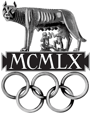

1970s

1980s
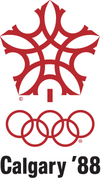
1990s
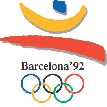
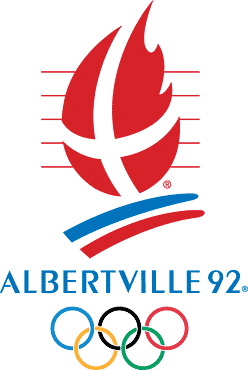
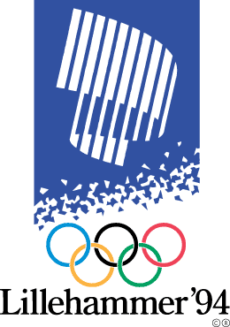
2000s
2010s
2020s
My personal favorites are (in no particular order):
- Albertville – Winter 1992
- Nagano – Winter 1998
- Salt Lake City – Winter 2002
- Torino – Winter 2006
- Sochi – Winter 2014
Weird. These all happen to be logos from the Winter games. Maybe design companies can think clearer when they’re cooped up inside with snow falling down outside. Although, there’s no saying when or where these logos were created. In any case, they’re definitely legit logos.
What’s your favorite Olympic logo of all time? Drop us a line below and let us know what you think.
NOTE: The original post was published in 2012, but this has been updated to include the additional logos


