We’ve shared how to modernize your website and how to know when your website just plain sucks. Now, in honor of spooky season, we thought we’d visit the scariest trends in web design – the ancient pages of the world wide web that were modern in 1999 but send shivers down our spines now. See if you can make it through this whole list without slamming your laptop shut in fright.

Browser and Resolution Recommendations
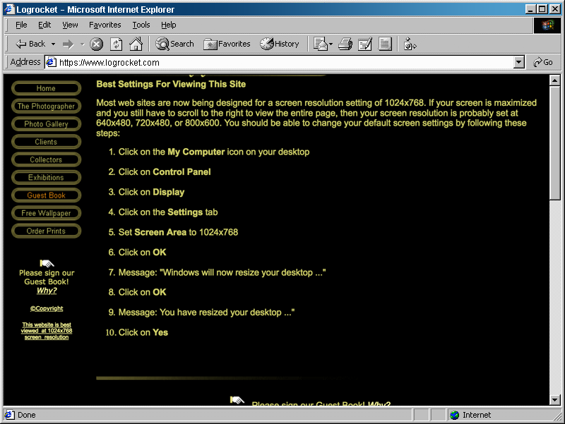
I could be fully asleep, and if someone asked me what is most important to a website, I’d still mutter “mobile friendly.” It is ingrained in good web developers to build sites that are compatible across devices and browsers. That is why these ghosts haunt my nightmares.
Remember when a website would tell you what browser and resolution the pages could be viewed on? There would be a note in the footer or at the top of the home page with a recommendation and maybe even instructions. That would be the equivalent of having a pop-up today that reads “This website is best viewed in Chrome on a Samsung Galaxy S21.” *shudder*
Tables
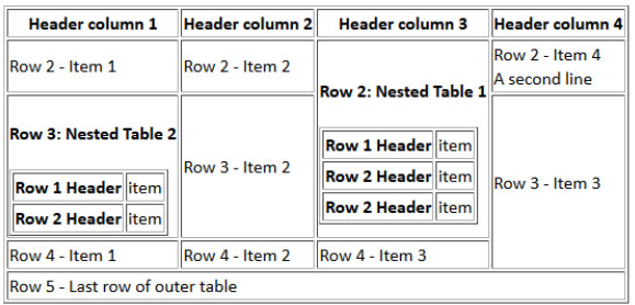
Back in the day, we had to use tables – yes, tables! – to create page layouts. I know what you’re thinking. “Aren’t tables meant for tabular data?” When web design first came on the scene, HTML tables were the best option. CSS-float based layouts weren’t widely known, and flexbox was still a decade away from being created. It was a dark time of nested table chaos, but we survived to see brighter days.
Unusual Navigation
All the UX research shows that clear navigation is key to a successful website. But the term “UX research” wouldn’t be coined until many years after horrible mistakes were made. When browsing a website in the 90s, you had to focus. You had to be aware of your surroundings and calculate each step. Breadcrumbs weren’t widely used, so you had to remember the trail you blazed and make great use of the back button. This brings back many terrifying memories, so instead of showing you the scariest of all, I’ll leave you with the classic example of a beloved website that frustrated us all.
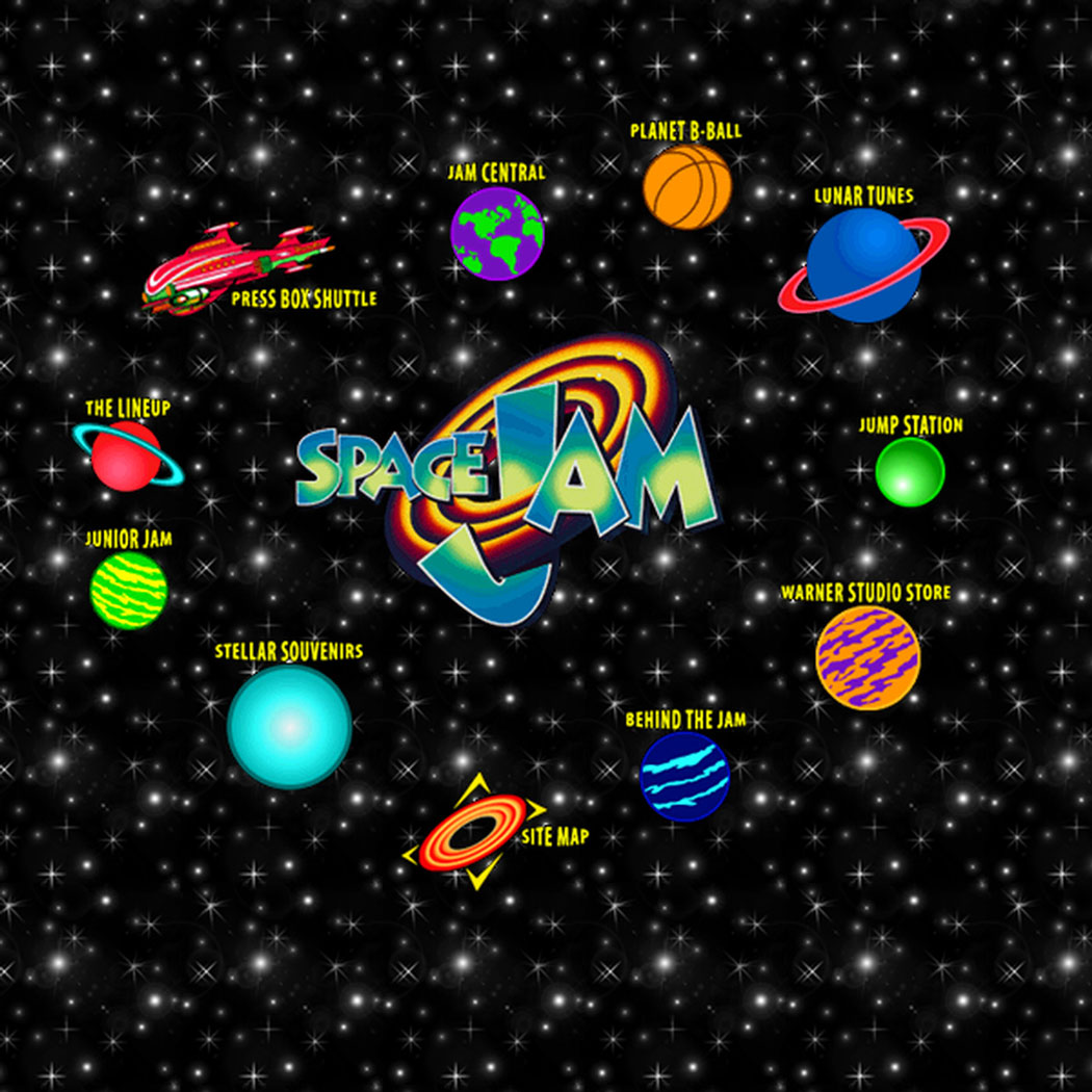
Psst – this site is still up. Take a trip down memory lane, and be thankful with how far websites have come.
Geocities
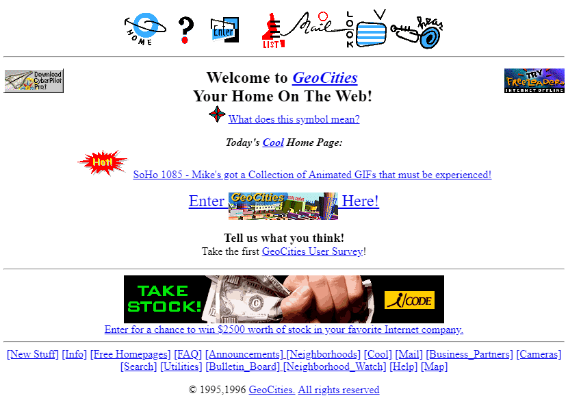
This one strikes less fear in me and more nostalgia. Back in the day, we all wanted to be “webmasters,” and Geocities was the place to do it. It was a place to build and host your own website for free, and offered a pretty good range of beginner-friendly tools to do so. It was my gateway into web development.
The beginning of the end came when Yahoo bought out Geocities. This was back in a time when Yahoo was even bigger than Google. (Remember that?) After that buy out, it wasn’t long before Geocities was shut down, and all of our Britney Spears fansites and cringe-worthy blogs disappeared in 2009.
(Probably for the best.)
Trick or Treat!
Have we got a treat for you! A developer who was nostalgic for the days of dancing baby GIFS and “Tub Thumping” created the Geocities-izer. Throw your URL in and see what your site would have looked like as a Geocity decades ago.
Flash Websites
This was going to be huge. Flash promised developers the ability to build interfaces that integrated multimedia content seamlessly. Audio and video would come together to create the ultimate web-based experience, and what better experience than a Matrix website built with Flash! We were ready to dive into another dimension when visiting WhatIsTheMatrix.com. But instead, we waited. And waited. And we went to grab a Surge soda and turn on TRL while we waited some more for that never-ending loading bar.
HTML5 was released, and Flash started fading into the distance. But it wasn’t until December 2020 that Adobe officially put it to rest. RIP Flash.
While the site is long gone, someone had the foresight to record the wonder that was the Matrix’s flash site.
Hit Counters
Hit counters were the flex back in the day. By publicly displaying how many hits your page had, you could brag to every person who visited your site how popular you were. I mean, it’s not like you could scam these basic tools by constantly refreshing your own page. I’m sure no one ever did that.
Today, hit counters have been replaced by much more sophisticated tools like Google Analytics and other 3rd party services, and we don’t recommend plastering those on your home page.
MIDI Files
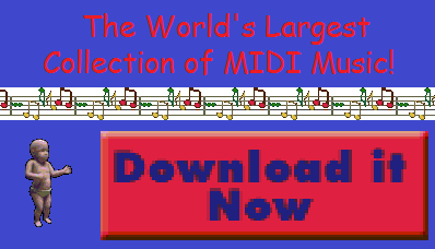
Ah, the MIDI files. Many Geocities had MIDI tunes auto-playing in the background. There was no way to know they were there, and no way to stop them. You’d just want to look around your internet buddy’s Final Fantasy site when the theme song would finally load. And there was nothing you could do.
We are still haunted by this atrocity today. Only now instead of MIDI files, it is autoplaying videos that stick with you even as you scroll down the page.
Scrolling Headlines
Remember how we really had to focus on the websites of yore because the navigation was so wonky? Well, the frustration didn’t stop there. Scrolling text was cutting-edge in the early days of websites. And we’re not talking a little bit of animation or a word being swapped every couple of seconds. We’re talking full sentences chasing each other across the screen while you avoid blinking so you can catch it all.
While this functionality still can be replicated using modern CSS animation, don’t. UX research and ADA compliance recommendations would put huge red X’s all over this idea. And for very good reason.

Home Pages
I know what you’re thinking. We still use home pages. We love home pages! But in the early days, home pages were regarded very, very differently.
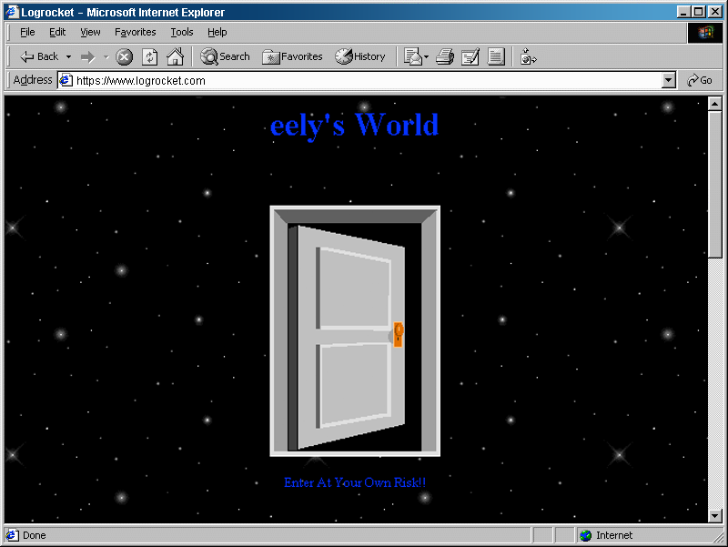
In line with Ready Player One and Snow Crash, websites were more common among individuals than business, and people viewed their sites as their literal existence on the internet. So a home page wasn’t a clear introduction and summation of their mission. No, it was a door. Maybe it even had a welcome sign inviting you into their corner of the internet. Or a warning for solicitors to stay away. If you ever see these doors, Turn. Back. Now.
Phew, it's over.
I know that was scary, but don’t worry. You will never see any of these features in a Mittun made site (beyond this super scary blog post, that is). We pride ourselves on staying up-to-date on the latest trends and technology, and we stay involved in the nonprofit industry so we can build only the best websites. But you gotta admit, this was a little fun.
If you need a palette cleanser, check out these modern Mittun made sites we recently built. We promise – nothing scary to see here.


