
Whether you are launching a campaign for Giving Tuesday, National Food Bank Day or some other goal, a well-designed website can make or break your food bank fundraising. And with the rising cost of food and the effects of COVID-19 still impacting individuals and families across the country, Mittun wants to help you optimize your campaign, boost your visibility and reach your goal to end hunger.
Invite Supporters in with the Hero
Since this is the very first thing most people will see when they come to your website, make sure it is doing its job.
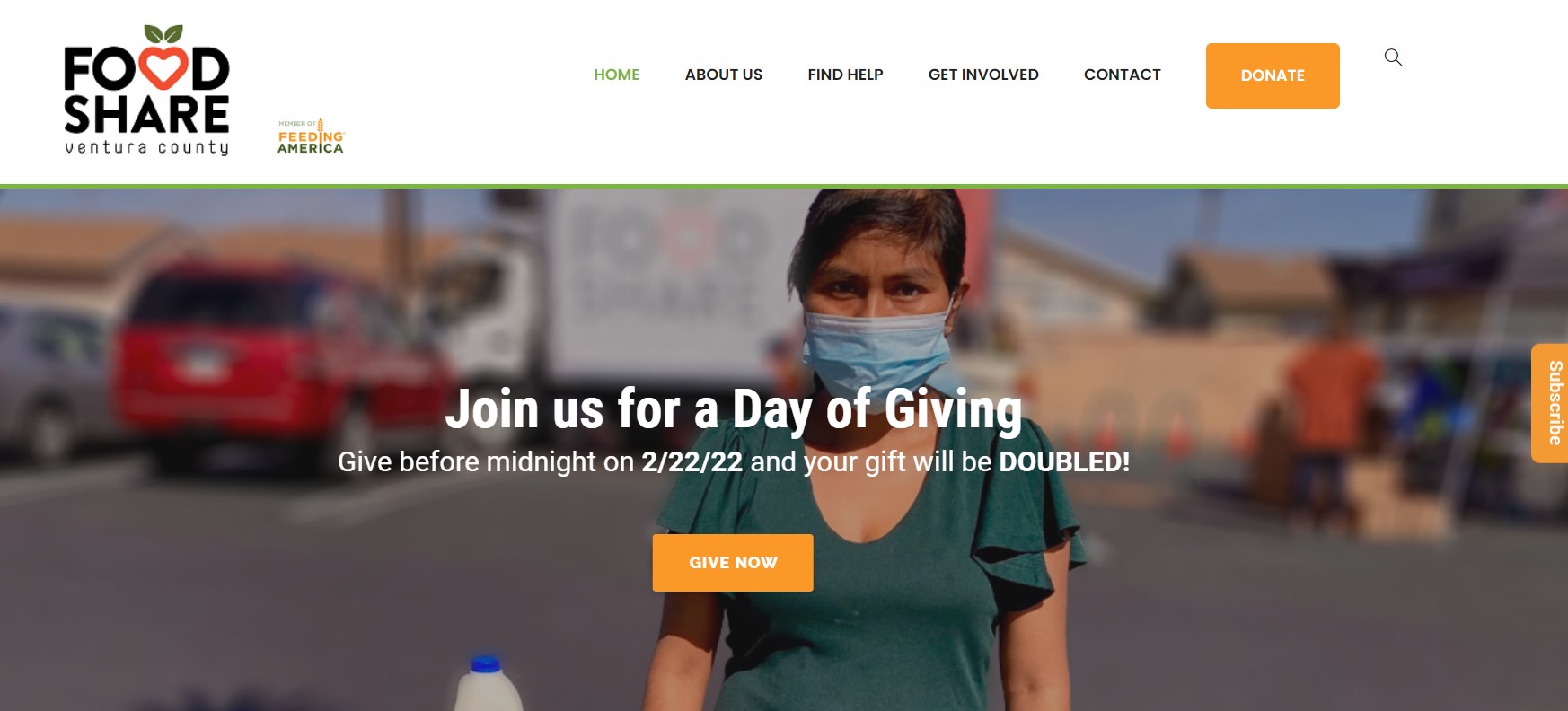
Food Share of Ventura County nailed it. The image is of an individual woman, and even though we don’t see much else around her, we can tell there is a story there. The copy is very clear that there is an ongoing campaign, and the CTA is front and center with consistent branding.
Your hero image should:
- Contain a compelling image
- Highlight a single CTA
- Be consistent with your branding
Don't Hide Your Donate Buttons
While there are many reasons people might come to your website and paths they might take, you want to make sure that everyone has a clear opportunity to donate – even if they aren’t going to the donation page.
Adding it as a button in the navigation using visually contrasting (but still on-brand) colors draws the user’s attention to it without taking away from their intention on the page.
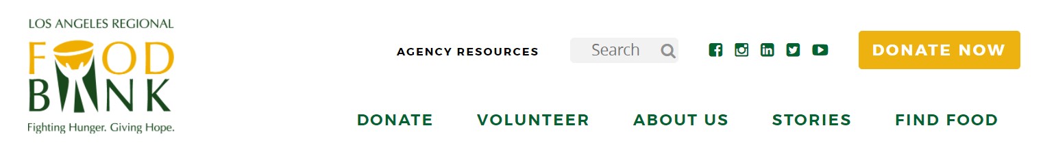
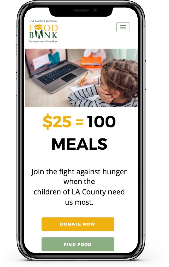
The LA Food Bank includes a Donate tab in the nav bar with a drop down to various methods of donating, but they also have a clear button that stands out. No matter what page the user is on, they will have an opportunity to address the need in their community.
Tell the Story
Digital marketing for food banks has an advantage over many other nonprofits – their mission is already understood. Everyone understands hunger, and no one needs to be told why the food bank is necessary. When creating a landing page, you can gloss over the “why” and go directly to the “who.”
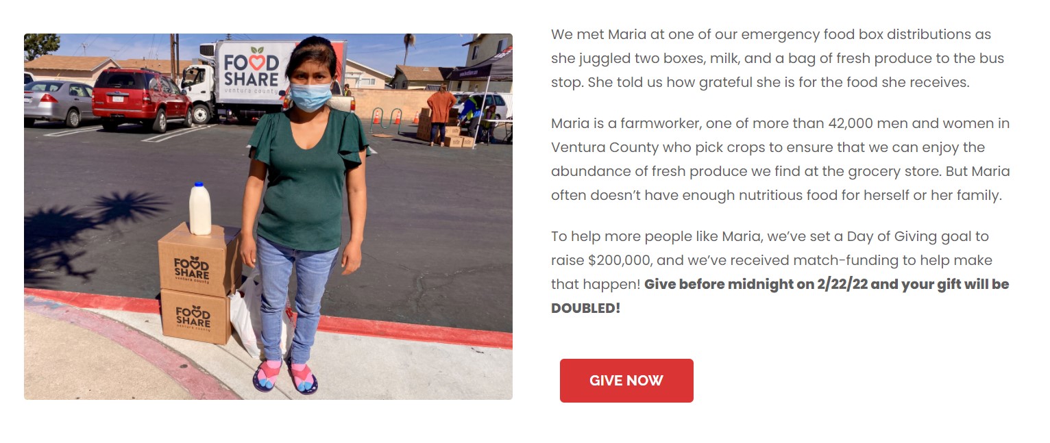
By zeroing in on a person or a family in need, it adds emotion to the campaign. It connects the user not to the food bank, but to the people who are being helped. Remember the hero image from Food Share up above? That woman did have a story, and they told it.
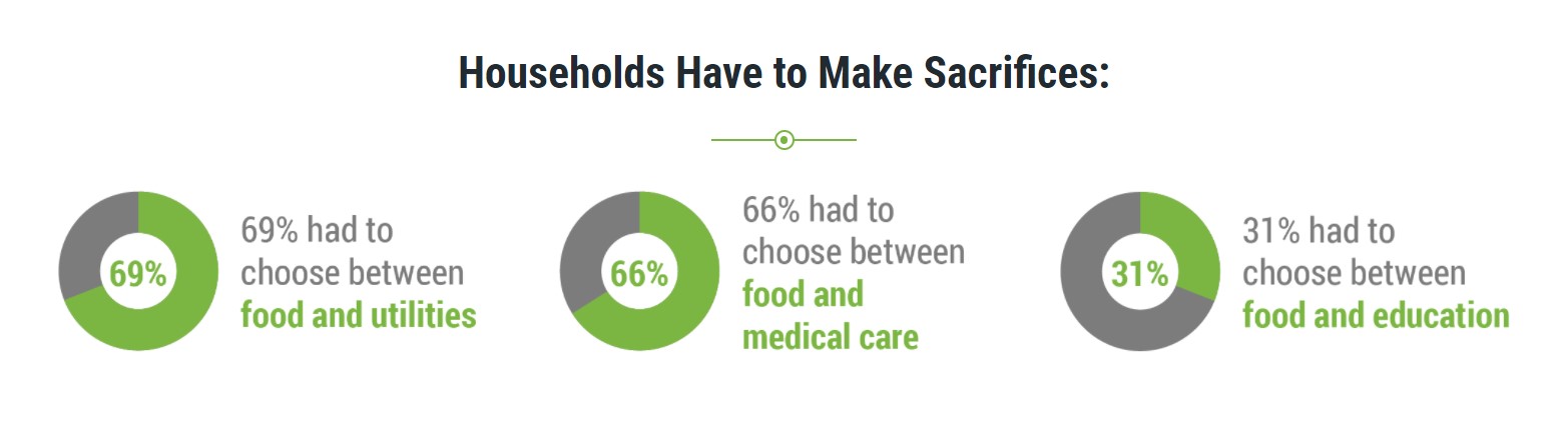
Food bank website design should also tell the story of the community. While most people understand food insecurity in broad and vague terms, they don’t always realize how close it hits to home for them. Share facts and figures about the demographics you serve, in the areas where your donors live.
Keep Your Pages Focused
Not every page needs a story and your mission statement and a CTA for volunteers and an explanation of all your programs and a link to your events. If each page is a dumping ground for all the information you want everyone on your site to see, it will be an overwhelming user experience. And that is when bounce rates skyrocket.
Instead, keep each page focused. This means each content section should seamlessly lead into the next section in a way that encourages the user to stay engaged. Also, the page should have a single goal in mind. Is the page meant to sign up volunteers? Register for an event? Connect someone to resources?
The only way to determine if your food bank website has focused pages with a clear user journey is a good old-fashioned audit. Go through each page and determine its message and goal.
Optimize Every Page for Mobile
Nearly half of all web traffic comes from mobile devices, and the number of donations made via phones is increasing every year. For the sake of user experience, you want your food bank website design to look good and function well across devices.
But it is more than that. Since mobile usage is so relied upon, Google has begun docking sites that don’t offer an optimized mobile experience. This means it will be harder for your website to rank against others and to show up on the SERP (search engine results page).
Thankfully, Google doesn’t point out the problem without offering a solution. You can drop your links into this tool, and if you pass, you’ll get a green checkmark. If you don’t, you’ll get a checklist of what needs to be fixed. Just remember that while this nifty robot does help you remedy code-based design and functionality errors, it doesn’t replace human testing for usability.
What's Next?
These five tips are just scratching the surface of food bank website design for fundraising. For a free assessment of your site or to get started on launching your next campaign, reach out to Mittun. We offer premier websites solutions for food banks and nonprofits – design services, ad management, digital marketing, and more. Let us help you create more good.
Check out a few Mittun made Food Bank websites. LET'S GO
Keep Reading

Is your food bank website inspiring donors?
Contact Mittun for a free assessment today.